Updated website brings fresh look, easier access to UC Regents information
Did you know that the bylaws and standing orders of the UC Regents were among the first UC documents posted to the World Wide Web when OP created its first website 16 years ago?
The Internet has been an indispensable tool in managing the tens of thousands of pages of bylaws, policies, agendas and minutes generated by the UC Board of Regents. And the redesigned UC Board of Regents website has just made it easier than ever to publish and access those documents.
The redesign is the result of a seven-month collaboration by Secretary and Chief of Staff Marsha Kelman and Associate Secretary of the Regents Anne Shaw with two UCOP departments: Communications and Information Technology Services (ITS). The goals were to make the site easier to navigate and access for both regular and occasional users as well as to update the visual design.
In addition to the improved aesthetic, documents are more consistently organized by type and date. Other improvements include a more robust search function, inclusion of videos of recent meetings, and the addition of analytics to facilitate ongoing improvements to the site.
“As a public agency, the Board of Regents audience goes well beyond UCOP and UC,” Shaw said. “Meetings, proceedings and policies need to be easily accessible and transparent to faculty and staff, students, the general public, members of the news media and the regents themselves.”

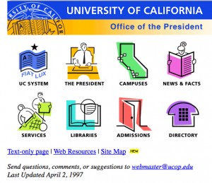
The bylaws and standing orders of the UC Regents were among the first University of California documents posted to the World Wide Web, when UCOP's home page looked like this.
In addition to generating content and staffing the Regents meetings throughout the year, Shaw had been doing web production herself, updating files several times weekly and posting at a moment’s notice in the days preceding meetings. As the site grew, she didn’t have the time — or the web expertise — to organize all that content.
That’s where ITS and Communications stepped in to provide guidance on web design and best practices. The challenge, said Web Editor Elizabeth Hull, was to update and restructure the site but not change it so much as to be jarring for regular users.
“Communications and ITS did 95 percent of the work,” Shaw said, “advising us on how to provide a design that would reflect the board’s independence and strike a balance between ‘welcoming’ and ‘weighty’. We’ve already had positive comments on how attractive the site is and how much easier it is to use.”
Check it out at http://regents.universityofcalifornia.edu/.


